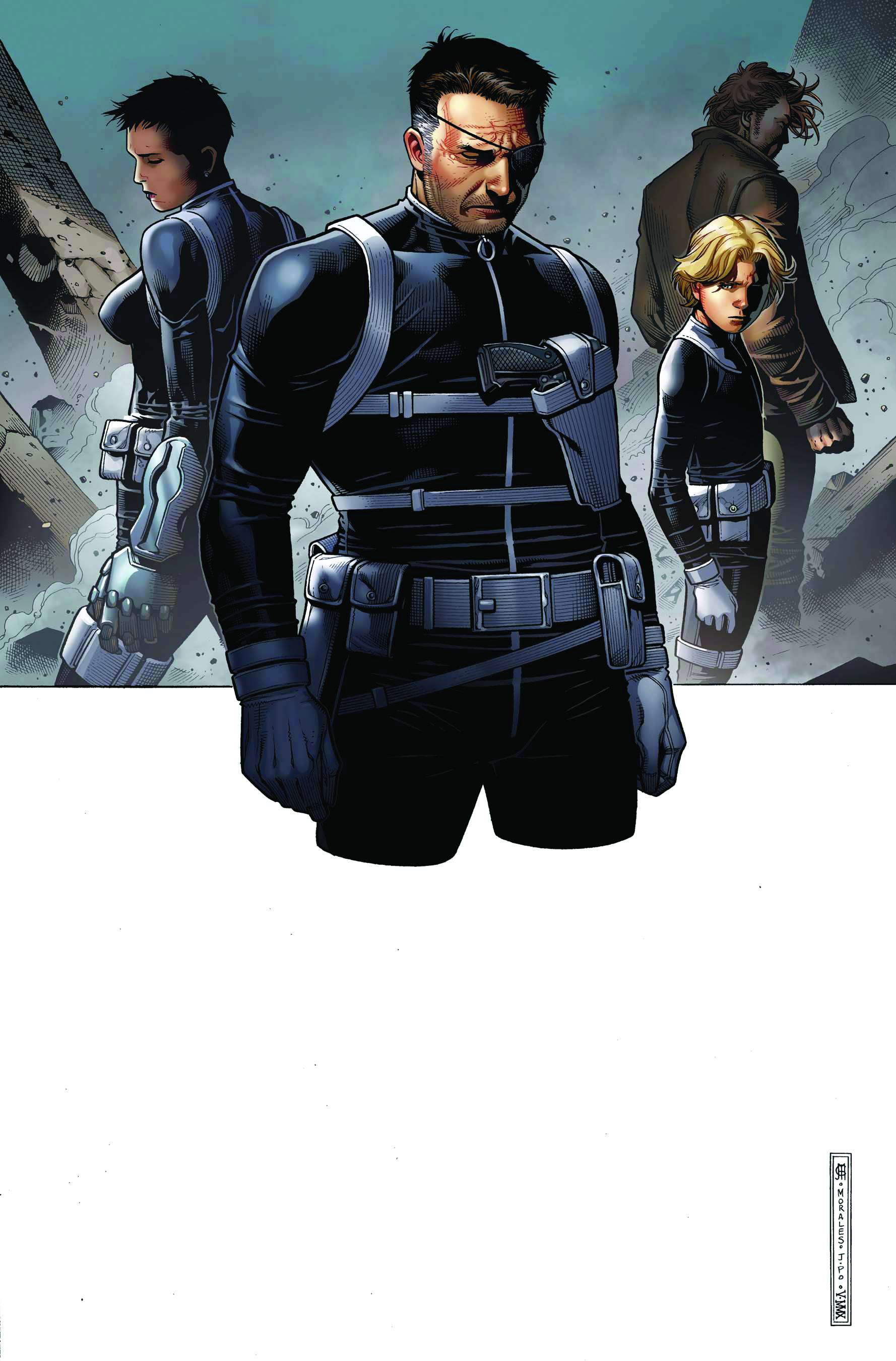
The previous storyline "Last Ride of the Howling Commando's" was a touching and heart-felt story that saw the end of a generation of warriors. It explained their history and their family/group dynamic in a way that made them more than character, more than character types... but as real people. Night begins six months after the fall of the Howling Commandos, as the war between the Leviathan and Hydra escalates to the world playing field. As they attack each other (and Fury), they leave a wake of death tallying in the thousands. It's time for Fury's end game strategy... too bad one of his own is going to sink his battleship.
 Perhaps Nick Fury just isn't as good as he thinks he is. If he was, he would follow his own rules (Rules that have been hammered home since the beginning of the series) and withhold information from his team until the last possible moment. That way he couldn't be betrayed by one of his own. The plan that ultimately lands them in a hot spot is an attack on Hydra's Gehenna base. Fury simply explains that the team will teleport in via Eden's powers, drop off a bomb and be out in a matter of minutes. That is until they are greeted by an army of Hydra soldiers waiting for them that result in Eden taking a gunshot to the back.
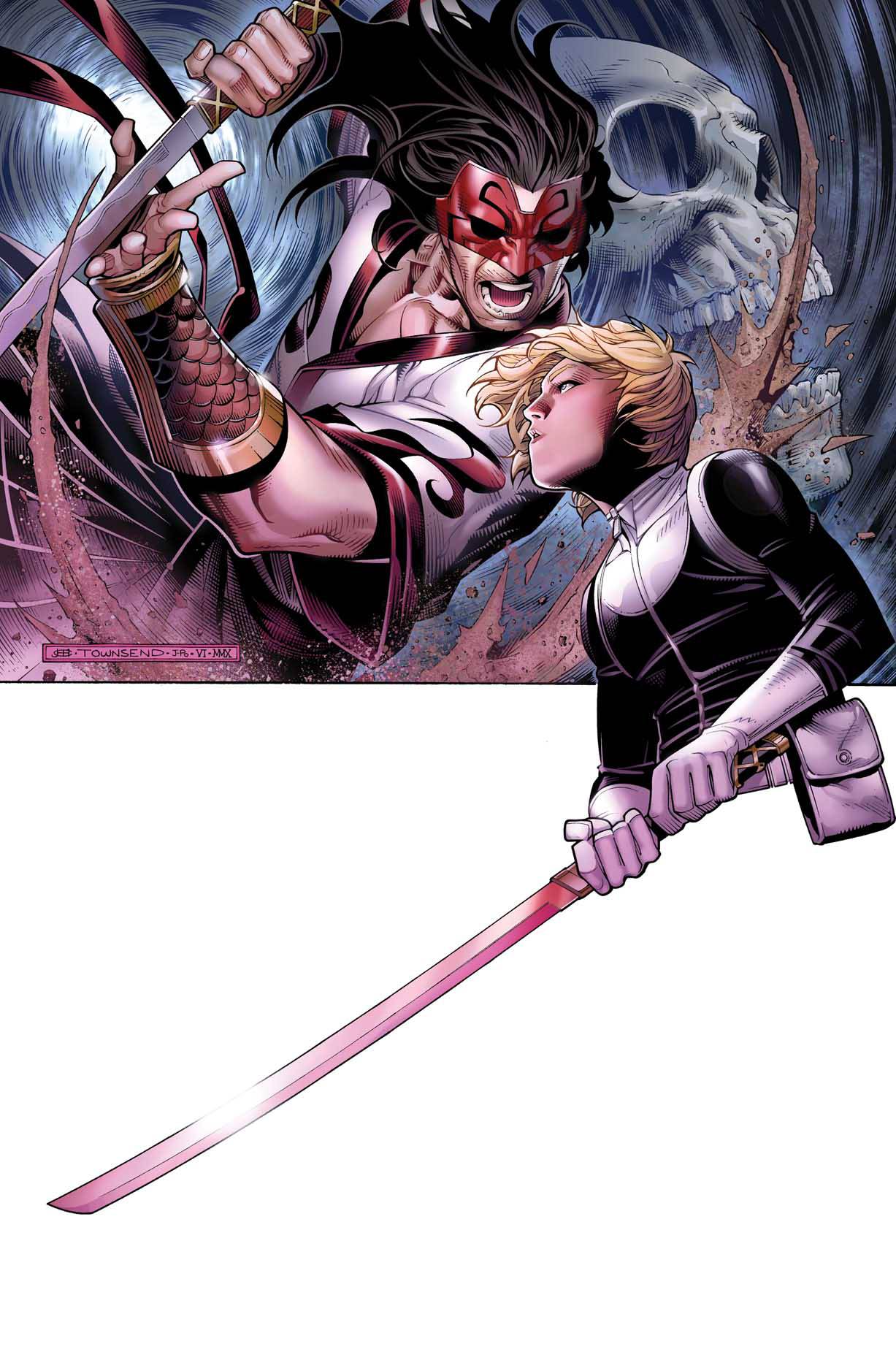
In part two, the group follows Phobos' lead as he finds a way out of the room that will surely result in all of their deaths. After half the team makes it to safety, Fury and Phobos find themselves on the wrong side of a cave in. Fury is a super-spy and of course has an exit strategy; unfortunately Phobos isn't tagging along for the ride. A match-up that's been alluded to for several storylines, finally plays out as Phobos squares off against the Gorgon.
My problems with these two issues boils down to one simple point... the art is terrible. In issue 20 artist Mirko Colak does a tolerable job, but furthers my point of the sliding scale of art on the series. The major problem with Colak's art is that every one of the characters walk around with their eyes closed. Even Nick Fury with his one working eye, barely opens the damn thing. The other major annoyance is the fact that most of the characters are unrecognizable. Costumes and captions make the rest of the crew easy to spot. The worst part of all this is, if the inking and coloring had been better on the book, the art would have been so bad to look at. In fact Colak has plenty of talent when it comes to drawing landscapes and buildings... just not eyeballs.
 Issue 21, seems rushed and drawn out. It's as if the editors saw an opportunity to pump out a quick issue and threw whoever they had to at the book to make it happen. This issue pairs Colak with Alessandro Vitti (the only artist to draw more than one storyline for the series.) The pairing of Vitti and Colak and their clashing styles is the most harmful thing that's ever been done to the series. It's as if they sent pages back and forth to each other and upon seeing the others work just said, "Well if he's not going to put in any effort... then neither am I!" Over half of the book is a fight scene. Imagine watching a movie in which two character begin fighting, but as the fight begins you can distinctly see that it's now two different men fighting each other with close ups and everything. Then imagine it happens again... and again, all within the same fight. That is the best way to sum up the art in # 21... horribly inconsistent.
The most disheartening thing is that the inconsistent art, the practically non-existent inking and the flat coloring ruin the stories intensity. Phobos a mere boy (with the power of a God) enters into battle with a man destined to kill... Gods. I only wish that Marvel could learn from the mistake that they make over and over again. Bad art ruins good stories, it's just that simple. I can think of several storylines, one-shots, mini-series that has been overlooked simply because people couldn't bare to gaze at the art. And no matter how many times they are recommended and spoken about they'll never be a classic or brilliant because comics need art that is just as fantastic as the story. Think about reading Watchmen with Rob Liefeld as the artist instead of Dave Gibbons and suddenly you have a book you'd rather burn than read.
Story – 10.0
Plot – 8.0
Pencils – 5.5
Ink – 3.5
Color – 3.5
Overall – 6.1