If you have a sensitive stomach this is not the comic for you. Even veteran horror fans may have trouble swallowing this truly disturbing but oddly fascinating comic book. It starts with the suicide of a cat.
Those of you who haven't run off to read happier material (or call PETA), Saint Chaos #1 kicks off the origins of Simon Monroe who is trying to build up the guts to kill himself. However, before he can he is kidnapped by the serial killer Honeycomb. But his story doesn't end in bloody death. Instead, Honeycomb tells Monroe he will kill him in four days on Honeycomb's birthday. In the meantime, Monroe tries to save some lives and the hero Saint Chaos is born... with only four days to live. 
Writer Noah Dorsey (Non-Humans) has created an interesting premise and doesn't slack with the execution. The dialogue between Simon Monroe in the opening is interesting, Simon Monroe's origins are as depressing as they should be and in real-life could drive someone to suicide, adding to the credibility of the otherwise insanely bizarre story. However, one thing that didn't really work all the time was the dialogue between the two main characters, Simon Monroe and Honeycomb. Honeycomb easily lets slip a lot of information about himself and it felt like something the character shouldn't be sharing so easily.
The characters Dorsey created are great. Simon Monroe is a depressing human being who you root for when he stands up for the down-trodden. The only thing I didn't really like about him was how he got his name. A kid basically said a bunch of obviously plot contrived lines, saying things like "you gave him a piece of Chaos" and he then said "Saint" shortly afterward. Can you guess what Monroe does with these obviously misplaced words? Makes a superhero moniker out of them. I don't mind the name, I just wish it was thought up in the story better. 
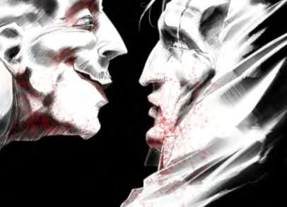
The serial killer Honeycomb made me feel uncomfortable whenever he was on panel. You know when a man says "slit the cornea of an infant" like it's a common saying he has some issues. His sickening smile could also rival the Joker's menacing grin.
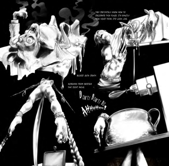
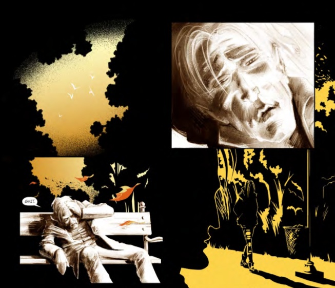
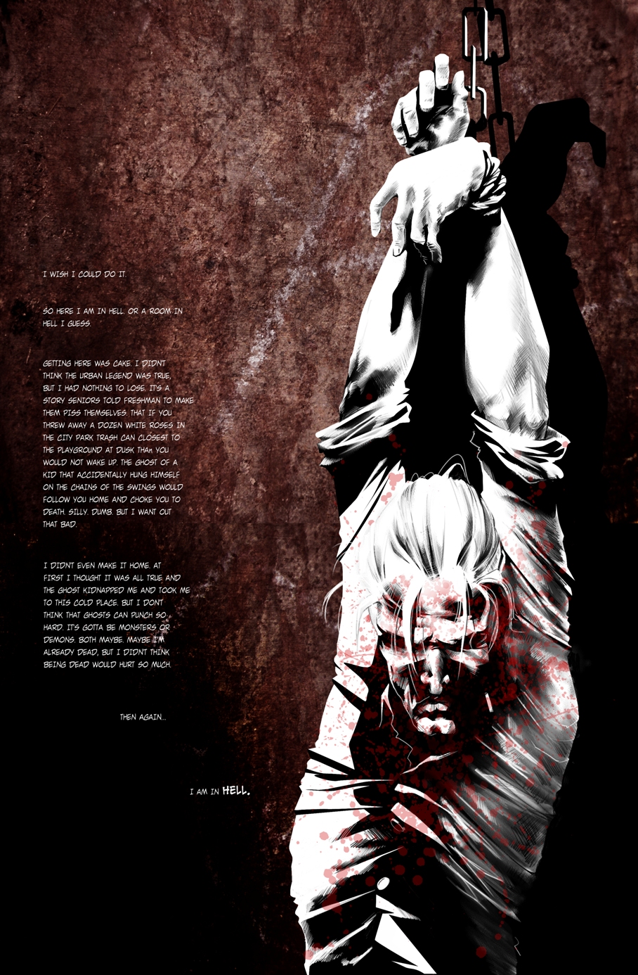
That menacing smile is only one of a dozen things artist Zsombor Huszka (R.E.M.) can draw. His style is extremely unique and definitely an acquired taste. The first part of the comic mostly has a color scheme of black and white like in the preview. After seeing only the preview I thought I would love the black and white mixed with red Sin City vibe the comic had, but later on it mixes in other colors like yellow, orange and blue which surprisingly add to the artwork even more. What's even better is Huszka's use of shadows. Usually my biggest complaint with a comic (and I'm looking mostly at you DC Comics) is figures are often pointlessly overshadowed – and I mean that literally. They are covered in so much blackness it's distracting from the overall appeal of the artwork. Thankfully, Huszka uses the shadows to his full advantage throughout this issue. 
The only problems I had with Huszka's artwork was when there was sometimes too much text on the pages and rarely are there backgrounds (especially in the beginning), just darkness. It can easily bore some readers if they don't have both interesting imagery and text to look at. Unfortunately, when Monroe is sharing his origin story, the artwork basically stays the same for the whole page with simply a look at Monroe's face and a boring black backdrop. It would have been nice to see flashes from his past to go along with what he was saying.
But everything else was masterfully drawn. However I stress again that it's an acquired taste, something along the lines of Menton Matthew III (Transfusion, Silent Hill). Their styles are different but I love them both for similar reasons: they are wonderfully gothic and different from any artwork you will see on the shelf right now. 
The biggest problem I had with this comic is, despite sounding minor at first, could become a really big problem: the text. Sometimes it's hard to read the text, especially in the beginning when it's white. One page in the beginning is particularly hard to read since it's white text with no text boxes behind it, making me have to zoom in to read it. The font also changes when Honeycomb speaks and while I thought this did add something to the creepy way he spoke it was, in some places, slightly difficult to read.
This is definitely something for veteran horror fans interested in something off the beaten bloody path and what I like about it is it isn't just torture porn. Oh, there is torture, but I feel like there's a level of emotional depth to it (disturbing emotional depth). People who are bad get what's coming to them in graphic gothic detail. There are issues like the annoying text problems and how this title is a little depressing so you need to prepare yourself for it. If you're interested in ordering Saint Chaos, you can order it on Mile High Comics.
And for a preview of the comic, check out First Look: Saint Chaos.