An Overview of Frank Miller’s Batman
Frank Miller is one of those creators that everyone has an opinion about: Good or Bad. Hell, Good and Bad in most cases. So many creators have gone, let’s say, off the rails in their later years – Neal Adams, for example – and it’s always such a shame to see that happen. Especially in the case of Frank Miller, whose failing health has prompted much online speculation – an aspect that has only been exacerbated with the rumors surrounding
The Dark Knight 3. So, an overview in order, I say and to take a look back.
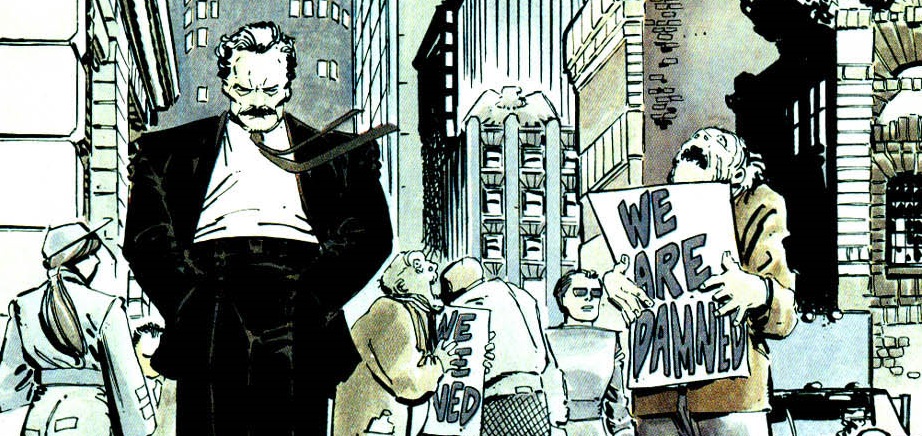
- Year One. Art By David Mazzucchelli.
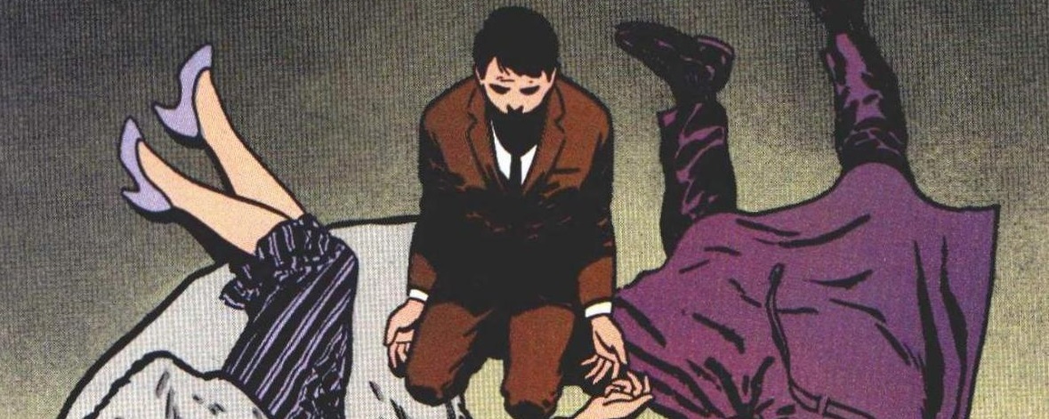
This is one of the most famous
Batman stories ever written, and for good reason. It is one of the most balanced and nuanced interpretation of some of the most vital facets of the Bat-Mythology. Jim Gordon, Bruce/Batman, and Gotham City itself are all displayed on top form. Noir-ish when it needs to be, cartoonish in the slightest of touches, and grounded only where really necessary.
Miller crafts great voices for Jim and Bruce, both desperate and powerful figures in their own unique ways – but also gives them a refreshing vulnerability. This is not even to mention the amazing linework done by David Mazzuccheli, who has always been a fantastic collaborator of Miller’s (see:
Daredevil). All of this, and a quaint timelessness, gives it that certain touch that makes any given arc a classic. Also, my personal favorite of anything on this list.
- Holy Terror! (Formerly: Holy Terror, Batman!) Art by Frank Miller.
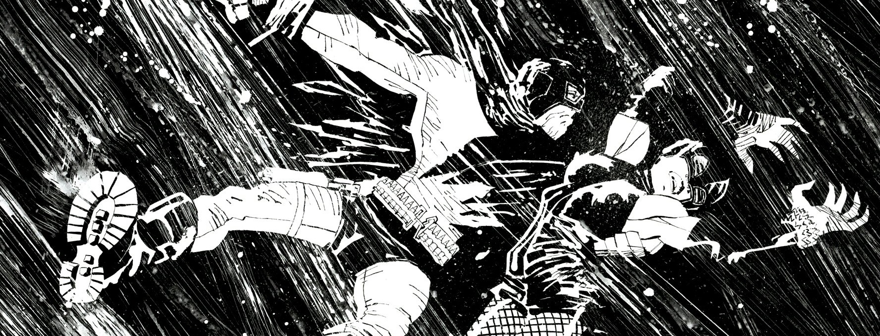
Yes, we are going to be going in chronological order in respect to where all of these fit into the patchwork Miller-Batverse, and next up would be
Holy Terror! Originally a
Batman tale before DC Comics, wisely, pulled the plug, it would have been set a short time after
Year One and tell the tale of Batman beating up some terrorists who have begun attacks on Gotham – and the story is still there.
Miller just switched out the names, that’s all. Now the main thing about this was that it was meant to emulate the old WWII war propaganda, the problem being that Miller himself exudes too much of that persona already for ANYONE to read with objectivity. Miller is too caustic for the line between joke and actual sentiment to be seen through by anyone. So, what happens when we cut that part out entirely?

The easy answer is that it’s a small one-shot of Batman and Catwoman having a rooftop romantic encounter, accompanied by some hazy art. Now, given that Miller writes some of the most fascinating Bat/Cat stuff (writing them as a mix between true love and adrenaline junkies), I would have been completely okay with that. It’s a cute in a very ridiculous way, in my opinion. Aside from that the only thing of value that the propaganda part gives is an actually chilling final page with “Not-Gordon”.
- All-Star Batman and Robin, The Boy Wonder. Art by Jim Lee.
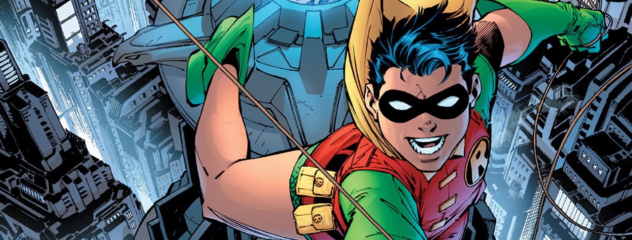
It had to come to this:
All-Star Batman and Robin (or
ASBAR for short). This is really the red headed stepchild of the whole Miller-Batverse, even more so than Holy Terror! The reason is that so many times I have heard that people don’t quite understand the conceit. They get that this is a Robin origin story, but that’s where many stop and where a lot of judgments on it get formed. That it’s meant to be a legitimate Robin origin.
The fact of the matter is that this story is overall meant to be an origin story for the Dick Grayson of the Miller-Batverse, who
SPOILERS: turns into a psychopathic serial killer. So a lot of the sequences between the Batman and Robin is predicated on that. Their subplot is about an origin story gone wrong. Is it done the best it could have been? Absolutely not, the dialogue and narration is very much a mess – but the effect is lessened through the proper lens. Everything else, however, there is not much explanation for.
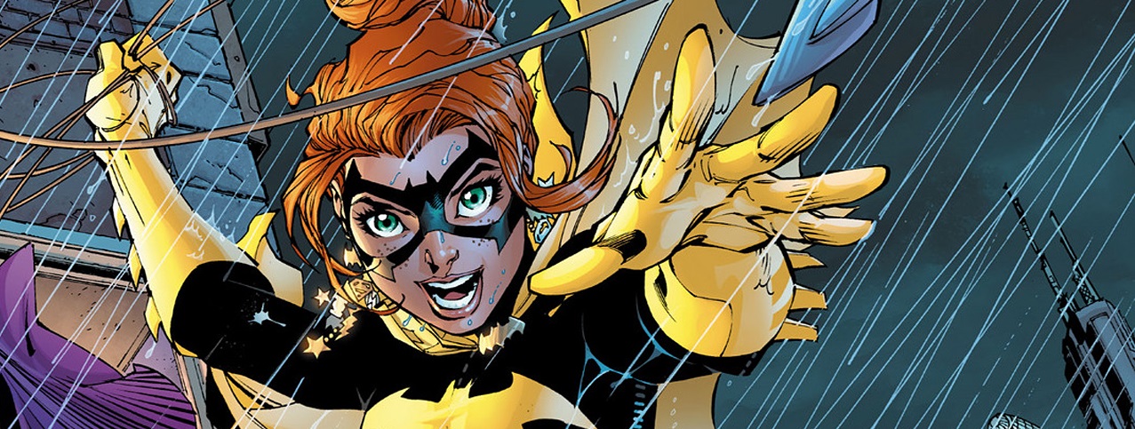
The entirety of Wonder Woman’s role is simply awful – and not the laughably incompetent at the stuff that preceded it. Although, like the infamously hilarious Green Lantern issue, it serves to set up
TDKSA, except even the GL bit was better. The only things worth noting aside would be the surprisingly fun rendition of Batgirl – and the out of nowhere heart-stirring moment between Bruce and Dick –
We Mourn Lives Lost. Including Our Own. A thing that keeps me from hating it all.
- The Dark Knight Returns. Art by Frank Miller.
Much like
Year One before it – there is not much to say about
The Dark Knight Returns that hasn’t been said in one way or another. It is Frank Miller at one of his best forms story wise – but definitely Miller at his best storytelling wise. The art done in
TDKR is surely among the best that Miller has ever done. People can denigrate the scratchy nature of what is presented on the page (yes, I have seen this done), but it goes far beyond that.
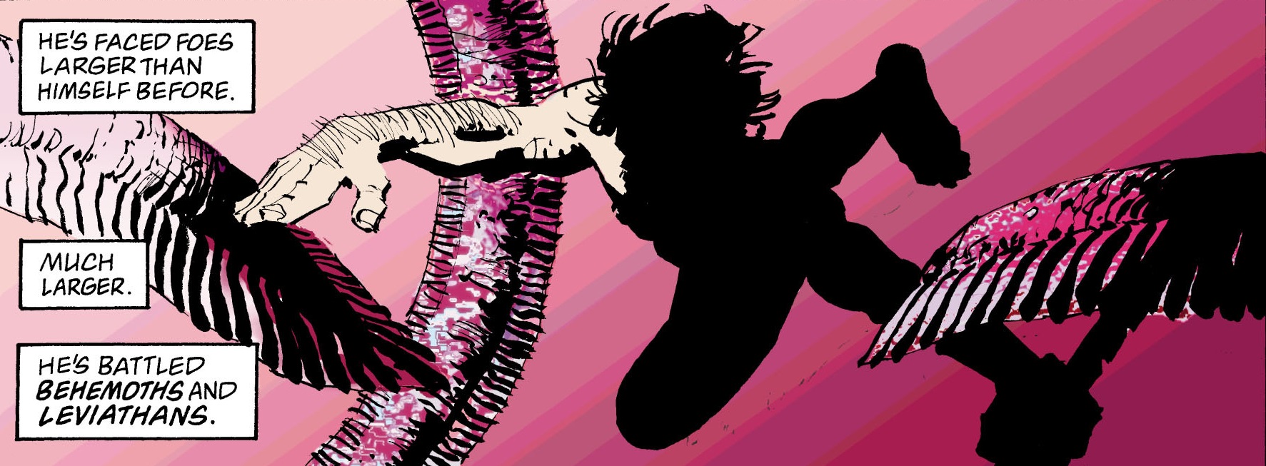
The panel structure alone, one of high panel count, is used to nigh-on perfection. There is not a single page of space wasted throughout the entire series. It’s not cluttered either – it’s just balanced and condensed. Miller used to be a beast at pacing and this shows it all. There are few, scant even, full page splashes within, but when they are used it is only for the best breather pages. The Carrie Kelly and Batman night soar is one of the most iconic for a reason.
Story wise,
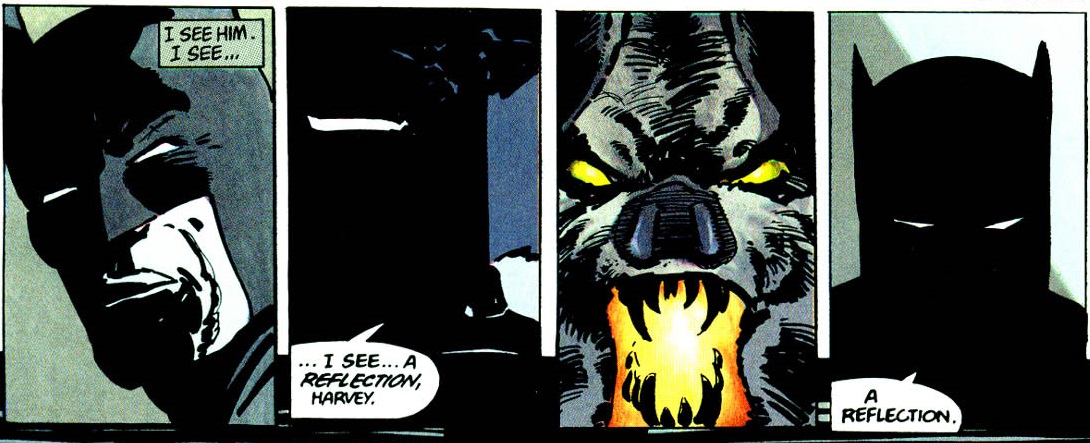
TDKR is solid. Yet, it’s not that amazing, because it’s not really the story that makes it the end all be all. It’s the art. Of course the story itself provides some great moments, such as the Two-Face sequence. Miller writes and draws one of the most tense and chilling scenes in
Batman history with that subplot. The message of Bruce’s inability to give up is also one of the strongest suits – and the Superman plot is way better than many give it credit for.
TDKR and
Year One are why Miller will still be a legend.
- The Dark Knight Strikes Again. Art by Frank Miller.
Alright, this is the last item on our list and also the easiest item to talk about. Just take everything I said about
TDKR right above and just reverse it. The art in
The Dark Knight Strikes Again is one of the biggest downgrades between original and sequel ever seen. While I said the art in
TDKR was used to maximum effect and never wasted – the art in
TDKSA is nothing but wasted! If only the frivolous splash pages or dwindling use of anything resembling panel innovation were the only things bad about the art.
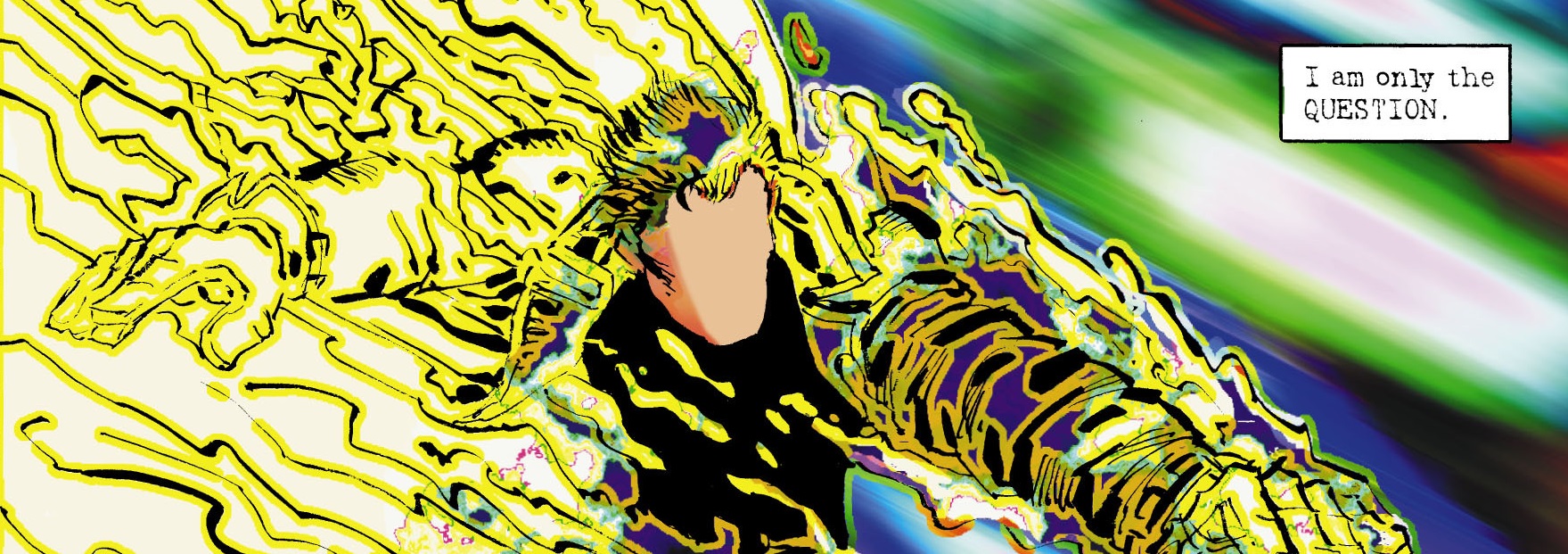
There also happens to be the matter of the eye gougingly awful coloring from Lynn Varley. Of course there is also only one time this otherwise painful to see coloring is used to any good effect and that is with the introduction of The Question into the story. Every single other time it is just awful – as is Miller’s line work as the series goes on. Story wise it is a complete mess.
It says something about a story when it takes a series as messy as
ASBAR to help explain away some of the weirdness portrayed in it. From the incoherent Luthor/Brainiac plot to Super-patsy. The only good moments are the slew of character introductions peppered throughout the story. The Question, The Atom, The Flash, Plastic Man, and even Green Lantern get in on the action for great character moments. Captain Marvel is simply a delight. Too bad the rest couldn’t have been on their level.
So, there we have a summation of the main Frank Miller
Batman oeuvre. It’s not a pretty sight, but it will stand as a big chunk of his legacy. The rumors of
TDK3 being a finale for this whole thing – one last hurrah – and it’s not unusual to be worried. I know I am – but let’s hear your thoughts. Speak your mind below on Miller and one of his tentpoles, it would be welcome.