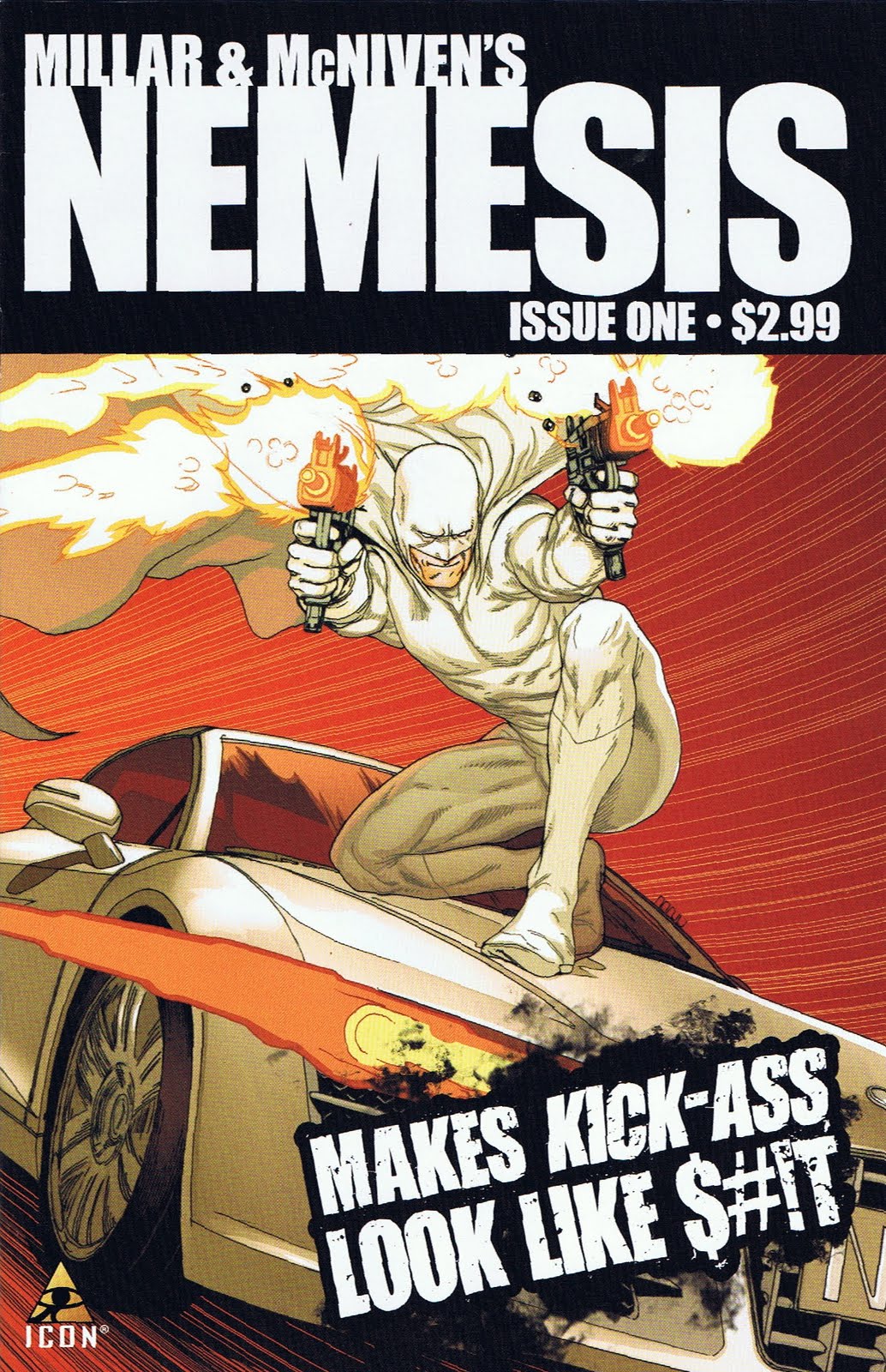
I would like to start by saying that the first rule of selling a product, be it a comic, a movie, a videogame or even a TV is that you do not insult your own previous work/product. Let me give you an example. Apple is releasing the iPad. They did not come out and say that the iPhone was a piece of crap, comparatively.
Before even opening the book, Mark Millar has told his readers that Kick-Ass is shit compared to this book. What does that say to all the people that bought and enjoyed Kick-Ass? What does it say to the people that worked on the book? Or even the artist of the book? It says that Millar’s previous work was in fact shit and that it was wasted time and money. You should have waited for Nemesis instead. Sorry if you bought Kick-Ass because it was shit, so says Mark Millar.
People are only going to like this book because of the two names on the cover: Mark Millar (Kick-Ass, Civil War and Wolverine) and Steve McNiven (Civil War, Wolverine). Here is the concept of the entire book: the world’s only super-villain challenges the world’s best police inspectors to best him. Nemesis is shown “defeating” a Japanese inspector and then moves to America. We’re introduced to the American inspector, Blake Marrow, by watching him blow away several criminals with a shot gun. This is our hero and he’s shown as a ruthless killer. The CIA informs Blake Marrow (who looks suspiciously like Liam Neeson) of Nemesis’s plans for him. At this point we are to feel compassion for him, even though he just killed seven men with a shot gun at close range. Blake handles the news of his scheduled death calm and collectively. His acute mind is already thinking and planning. 
There was a point in Mark Millar’s career where other writers envied and copied his story ideas. Ironically, it seems that Mark Millar has become one of those people as well. This book is high concept, low content. The book leaves the impression that it’s trying to be gory. The problem with gore is that it has to be detailed and anatomically correct. McNiven is a phenomenal artist and it’s good to see him doing anything over that variant covers, but he is not a gore artist. He’s an action, splash page, fist-a-cuffs artist. Every character’s face was devoid of emotion. Even when Nemesis is supposedly taking great joy from being a villain, it seems more like he is just going through the motions. If while reading this you disagree, then I ask: Are you projecting your own emotions onto the page? Are you so excited for a new Mark Millar concept that you’re willing to excuse mediocre writing and give it a free pass?
The book from a technical stand point is not bad. It’s well constructed, tells a story in three acts, and has good art. However, there are bad parts. For instance, there are two scenes in which characters are talking to each other about a third character or an event. Not only is this bad writing but it fails to build, in this case, the “terror” that Nemesis is supposed to instill. If you’re going to dialog how evil someone is then don’t. Instead, show me. After all, a comic book is a visual medium. The art is flat and un-interesting. McNiven is a great artist but I don’t see any interest in the art. It’s devoid of the details his style is known for. This is more than likely due to him inking his own art. The colorist, Dave McCaig, plays a huge part in this book’s failure. He attempts to color the book in an Anime style and it’s not working. The color is very flat and nothing pops out. You’d think that a character that’s wearing all white would be bright and stand out on the page, but he doesn’t. Nothing stands out, not even the blood found on nearly every page.
Again, this book is not bad. It is very boring and un-interesting. Not only is the overall plot boring but it’s transparent. If Millar wants to surprise the reader then the Hero will win and best the villain. This is Mark Millar we’re talking about though, he loves villains. At the end of it all he thanks you for buying the book. A book containing unknown characters in an unknown world that you’ve never been a part of before. And if you’ve never read anything independent, read/watch anything from Japan, then you may very well have been exposed to something new. If you have, then move along there’s nothing new here. Upon finishing the book you should ask yourself why it includes a two page spread for Millar’s other Icon project… Kick-Ass, which I hear is shit.
Story – 4.5
Art – 6.5
Color – 4.0
Overall – 5.0
Dustin liked this book better when it was called Black Summer and Warren Ellis wrote it. You can follow Dustin on Twitter or ask him questions at FormSpring.