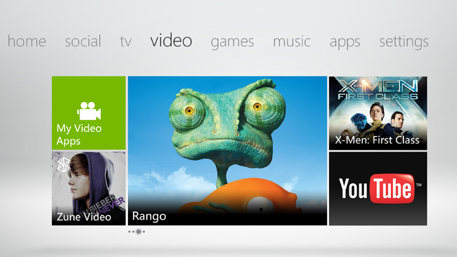
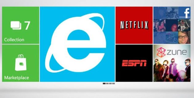
Around this time last year the Microsoft team came to the end of months of hard work and development and gave us the new looking Xbox 360 interface, code named "The Metro interface" which completely redesigned the menus by flattening the Dashboard's cross-bar style navigation into a series of 7 scrollable panels that all came with their own options. To be honest I thought the initial change was great and I really digged the new interface after a week or so of using it. Now we have a new update to the dashboard that was released last week. So, what does this update bring to the table? The various "Panels" that make up the Xbox experience now house between nine and twelve tiles per category. This now includes product advertisements and recommended games and also a new web browser! Today we will be looking at the new dash and will see if it really is as good as it's cracked up to be!
Microsoft has "simplified" a specific piece of the Xbox Dashboard, resulting in a more filled desktop and removing the "xbox live” title panel. You can see that Microsoft are trying to implement the stylings of their mobile OS as seen on many popular smart phones/tablets and these were never present on the Xbox 360 dash until last year's update which brought out a "featured" square that rotated and passed through content when you hovered over it, which kind of emulated the functionality of the mobile apps design. There was one “square” on almost every channel, which offered the user five rotating spots for advertisements or recommendations etc, and the new Dashboard instead gives this content individually on its own panel. This does seem like more of a practical use of space but since 75% of the information available is advertisement, it often appears as a blur of colors that can become confusing and isn't too welcoming on the eye.
Another medium that it pulls ideas from the Windows Mobile OS is the implementation of "pinning” On a Windows Phone running the Windows 8 mobile software, pinning attaches your favorite apps, content or shortcuts and then "pins" them to the your home screen, This is a great addition and adds a lot of personality to the user's work environment, however, pinning on the Xbox doesn't work “exactly” like that. Items can still be "pinned," which adds them to a special "My Pins" sub menu, but pinned items don't actually appear on a singular, first desktop panel. The feature uses the same theories as other mobile and desktop operating systems but falls way short of offering the same functionality. It makes you believe you can have that one pane that allows you to customize a unique home screen that was representative your own tastes. While the pin menu does offer quicker access a list of favorites, it seems unlimited and only does a half hearted job of “copying” this feature from its mobile sister systems.

The update also remodels the "quickplay" item that was introduced only last year which removed the app launcher from the Xbox guide, and re-penning it to the "recent" panel on the console's home screen. This is small tweak for users who navigate from the guide menu. Fortunately, recently used items are still be accessed through the guide's "Games & Apps" menu. The additional ad-space is managed a lot better in some channels than others. Form example, The music Panel offers the “Xbox Music Pass” which subscribers are given quick links to new releases, a top 100 playlist and also popular music videos. Similarly, both the Games and TV & Movies feature tiles offering content tailored to the user's interests based on previous content they have accessed, with a third tile offering a wider selection of recommended content. Again, these recommendations are still a form of advertising, but it's smarter advertising. For example if you play a FIFA game, It will display FIFA related add-ons or additional content. (well it did for me!) Thankfully though these recommendations can be eradicated by using the new Dash's rating system. By pressing the X button whilst on this panel will dismiss it or rate it out of five stars. Games can also be rated on their individual pages (kind of like the Apple app store) but for some reason the rating option doesn't appear for Xbox Video like with YouTube. Microsoft told us that the new Dashboard was offering more than just a minor branding tweak as far as the media services were concerned, which I thought was quite interesting as Apple seem to have given us an industry leading platform with iTunes which is being constantly emulated by other companies and the new dash no different in trying to implement stylings from the App store. The new dash however, I feel falls short of offering a media experience on par with Apple just because the App store and iTunes store offer a streamlined approach, compared with the complexities of multiple panels with the new 360 dash.
Next we move onto Internet Explorer which has dwindled over the years with the likes of Google's “Chrome” and Mozilla’s “Firefox” taking the beacon from IE as the most popular browser. Using IE on Xbox 360 is relative to using it on a Windows Desktop. It’s sluggish and slow with some sites like the BBC website loading perfectly allowing me to play the latest videos, scrolling painlessly through the page, This however is just a small example of it working great. More often than not Microsofts Xbox 360 IE version won't even scroll smoothly while fully loaded, and most pages have trouble keeping up with the user's movement, spluttering across the page, and taking abnormal times to load pages. More so, failures are also apparent with video streaming using IE. It’s mostly incompatible with most streaming video extensions, and lacks relevant plugins for most of the webs standards. The Xbox website streaming content played fine, but YouTube and most embeds wouldn't load at all or asked to download Flash. HTML5 on the other hand worked averagely, but not particularly snappy when compared with IE. This browser isn't easy to use either. One thing that is nice about the 360's version of Internet Explorer is what is known as the “Web Hub”. The Y button in this menu brings up a URL bar with a kind of “history” with recent or favorite web pages. It reminds me of a mobile OS where multi tasks are seamless and this works really well with IE for 360. One thing about the hub is that it can utilize the Kinect allowing navigation through voice control. I didn’t test this as I haven’t got a Kinect but from what I can see with others perceptions online, It works relatively well. Facebook and Twitter have now been merged into IE after Microsoft said "We are retiring the Facebook and Twitter apps," "Xbox Live subscribers will have the ability to access these sites through Internet Explorer on Xbox, available through the Web Hub located on the new dashboard." It seems that the apps were unpopular otherwise they would have kept them so now we have to use them via IE which is a bold move considering the struggles it already faces with its stability.

On reflection, the new dash update does offer some nice touches that add to the users experience with introducing the favorites, Pinning and ratings tabs. The new Pin feature could have featured a singular, customizable home page in the essence of a Windows desktop, but in reality it only passes as a rebranded favorites menu which is just another panel in a long line of panels. The new browser is nice and compact but will need to be patched thoroughly to give a better overall experience. If we compare it to the PS3 browser, It’s just as flawed and needs a lot of work. I think it’s worth the time taken for the update, but don’t expect anything majorly new that will revolutionize the console gaming experience.