I am a firm believer that graphics are not essential to a games success; Tetris and Mario are the best known examples that games don’t have to look great to be great. Video games are a medium where substance always triumphs style. Conversely, there are examples of great movies that are more interesting visually than they are thematically compelling--- the work of Terrence Malick comes to mind. His best known work, Days of Heaven, uses the lush visuals to elevate the bare bones love story to a level of almost heavenly beauty. Now while films and games more different as mediums than they are alike (films are passive viewing experiences, games are interactive) they do share many of the same visual tools.
In cinema, the camera is a static viewing object. The director stages the action to take place directly in front of the camera. In videogames, especially since the advent of 3-D/3rd person worlds, the ideal camera angle was the one that best matched the action in the game relative to the operator using the controller. It wasn’t meant to be artful--- it was meant to be functional. Games have gotten to the point where developers have an entire team dedicated to making sure the user interface is presented seamlessly. If a player has move the onscreen character while having to mentally readjust their button inputs, it's considered flawed design. The focal points of the game are the avatar and the target, everything else is literally set decoration. Because so much of the visual scope is lost due to necessity, I find this somewhat disappointing, there is so much space left unused. It wasn’t until I watched someone else play GTA 4 that I truly appreciated the beauty and design of Liberty City. For all of the time I spent there, 95% of my focus was on Niko and the road in front of him.
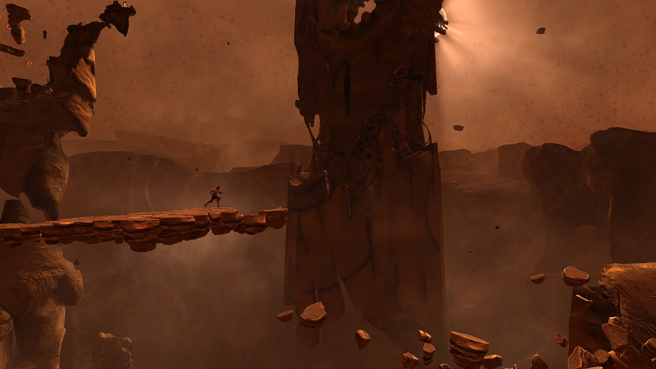
This brings us to Castlevania: Lords of Shadow (LOS), camera, and visual presentation. The most frequent criticism of LOS has been the camera. While some battles provide a dynamic camera operable via the R joystick, more often than not, the viewpoint is static or set to one or two movements. I believed this to be a flaw with the game design until I kept coming upon one absolutely awesome visual after another. Look at this shot:

Who decided this was a good place for an outhouse?
Most games would center the view directly behind the avatar; but MercurySteam (the primary development team) continually presents a larger perspective of the world so the games protagonist is but a speck on the screen. Making sure this visual change is not a hindrance to the player, invisible walls are cleverly integrated to prevent mishaps. They are placed not to limit exploration (as many critics have claimed), but to prevent a player from steering off a cliff to certain death. The perspective shift and game design allow for a game where the focus is on action in the world, not merely the action. There is artistry behind the visual presentation of LOS, and it pays off wonderfully. I enjoyed this game on a visual level more so than any game since Shadow of the Colossus, but all of that would be for naught if it didn’t make sense within the context of the gameplay. LOS is not a traditional Castlevania game (more on this later), nor is it a button smashing 3-D God of War clone. Castlevania: Lords of Shadow is first and foremost an adventure game, one that has more in common with Uncharted 2 than it does with Symphony of the Night, and it’s a superb adventure game at that.

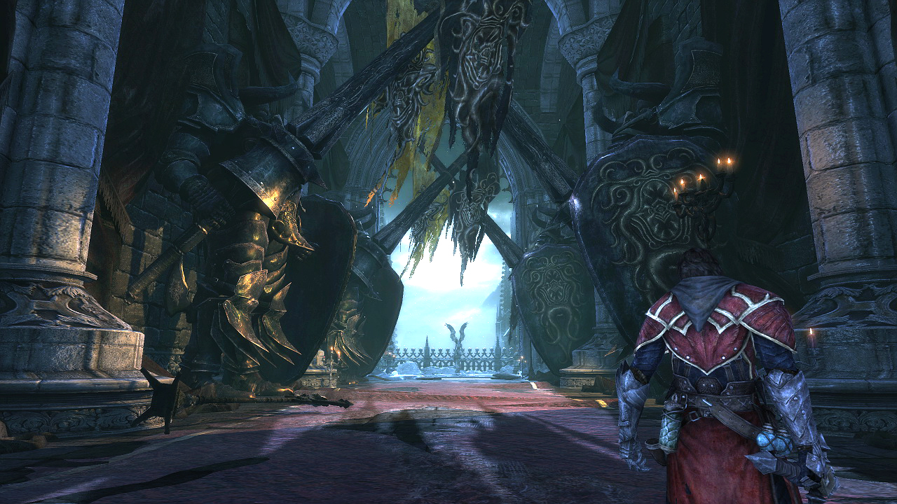
Gabriel prepares for his latest TSA screening at LAX.
While LOS is an stylized adventure game unlike few before it, it is not a wholly original one. There are many elements cribbed from other successful franchises, God of War and Shadow of the Colossus being the most recognizable. This is not a bad thing but it can hinder one's enjoyment of the game, especially at the beginning. The games hero, Gabriel Belmont, uses a whip (called the combat cross in the game, but trust me...it's a whip) as his primary weapon. Given the look of the weapon in action and the two button control scheme, the Kratos comparisons immediately come to mind. For the first two hours of the game, LOS's combination of a slower-heavy strike and a speedy-ranged attack begins to veer into Heavenly Sword territory, a 3-d button masher where the attacks were the same 20 minutes into the game as they were 20 minutes from the final boss.
But as the player gains more experience, they learn new combos and attacks that transform the combat system from a liability (Dante’s Inferno) to an asset (Bayonetta). I tend to believe this is a deliberate approach, as the game introduces more elements to the battle in a controlled fashion. While some complain it’s a poor design, I tend to believe MercurySteam is making a smart decision by instilling a learning curve for the gamer. It’s a risk, but I value the decision because it forces players to consider strategy for battles from the outset instead of upping the difficulty of the enemies once the character is fully powered up.*
*I blame the original God of War for this trend. In most games before GOW, it took a while before the player felt comfortable fighting enemies; Super Mario Bros 3 waited to introduce the Frog, Hammer, or Tanooki suits. But within 3 minutes of God of War’s first level, I was smashing buttons, swinging the blades of chaos and mauling everything in my way like I was the baddest warrior known to human history. It didn’t take any skill at all to turn Kratos a killing machine, and developers have been dumbing down combat to allow players to feel like kings out of the box ever since.
By the time the player reaches the halfway point, the player has 3 secondary weapons (including a summon), a light magic gauge which can be switched on for health recovery, a dark magic gauge used for more damaging attacks, and a combo bar which rewards the player for hits landed or attacks dodged without receiving enemy damage. Both gauges are filled by neutral element orbs, which are either dispersed by enemies or infrequent healing stations. The arsenal of the upgradable moves are separate from these orbs, unlike GOW, and the currency for new moves is XP, obtained only by killing enemies. I like this concept over the GOW or Bayonetta systems that allot points from smashing random interactive objects (vases, chests). In those games, a player is almost forced to go on smash missions to get to the top weapon upgrade. In LOS, if a player wants to unlock the top attacks, the only way to do so is by combat.
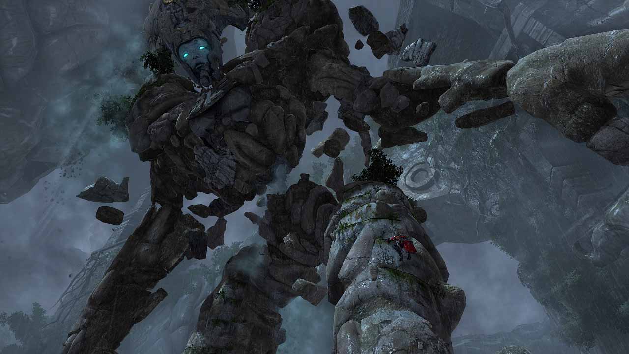
This is not a short game. Its 20 hour run time is among the longer the 3rd person adventurers to come out in the last 5 years. There are positives and negatives to this, but for the most part, the length of the journey is welcome. MercurySteam does three things extremely well in LOS: Visuals, Combat, and Boss Fights. I’ve already addressed the visuals and combat, but the boss fights are perhaps the best part of the game. Look at this still below:

“Yeah, I’ve lost some weight. Since the recession, all the wife can afford at the grocery is cheap, flavorless granite…
In case you can’t pick him out, Gabriel is right and down of center of the picture. That’s not just a frame from a cut scene. This is from the battle with the Stone Titan who is actually even bigger in the game. He is the second boss of this size, but I stress, not the second boss overall. Shadow of the Colossus comes to mind, and the gameplay of climbing crags and puncturing weak spots doesn’t dissuade the comparison. Thankfully, these are but a small portion of the boss fights in the game.
I mentioned the need for strategy in combat earlier, and it’s never more vital in the more traditional boss battles. On a difficulty scale of 1 – 10 with 1 being Andrew Ryan from Bioshock and 10 being Zeus from God of War 2, almost every battle in LOS would score above a 7 for difficulty. The fights require the player to engage the enemies from multiple fronts, switching between light and dark magic as needed, all while dodging relentless attacks. The bosses won’t simply overpower the player with brute force--they are all wickedly quick too. The battle with the head lycan was my favorite this year, surpassing the Hercules (Heracles?) battle from GOW 3 and White Witch finale of Bayonetta.
Not everything about the gameplay is as fun as the boss fights, and even the spectacular vistas can’t compensate for the sometimes repetitive and basic platforming. The scaling and rappelling actions in the game are nothing new and have been done slightly better before; if not for the mis-en-scene composed in fantastic environments, the sections would be borderline tedious. The platforming and combat sections rarely came together to in a cohesive manner, making the adventure episodic and “gamey.”

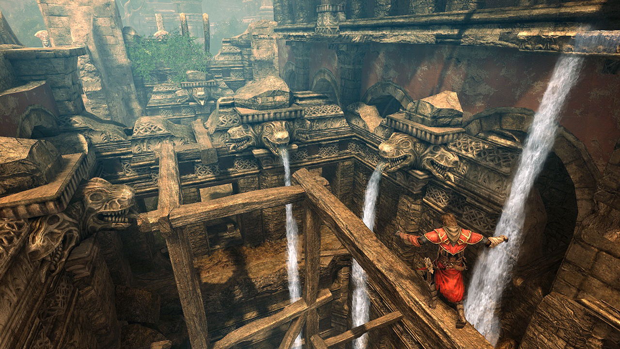
"The gargoyles, 11th century Transylvanian? I like the detail."
As with the games visuals, the production quality of the game is exceptionally high. The score and music-always highlights in the franchise- are stirring and epic, with the Lord of the Rings reminiscent music accompanying the Witch/Raven boss fight being my favorite. Robert Carlyle (28 Weeks Late, Trainspotting) is suitably brooding as the voice of Gabriel; he plays the role of a lovelorn warrior in over his head with a wary edge that fits the mysterious nature of the narrative. Patrick Stewart (Star Trek: TNG) plays Zobek, an elder warrior who guides Gabriel and also serves as narrator. His vocal talents are as impressive as ever, adding elegance to the dry and heavy-handed mysticism of the back story.
There are some other nagging flaws of the game; but I found the lack of multiple save slots the most baffling. Seriously, it is 2010, why would a game not have save slots? While the ability to replay missions tempers this, are households supposed to buy separate hard drives if two people want have their own games going? Also keeping the game from a higher score are game-play related problems. There are stretches of the game that are almost dull, the excitement level of the game doesn’t truly kick until the 4 hour mark, and the lack of on-screen prompts is puzzling. Most perplexing, are the puzzles, some which require Doom style quests for keys, which comes off as an afterthought to the level design. If this was supposed to be a reinvention of the franchise, why use outdated quest system?
Yet some of the stretches in the game were among the best I have encountered this year. I loved the boss fights, and as the combat system opened up, I was anticipating each battle sequence so I could take on the next set of baddies. The visual styling and stylized viewpoints force the player to pay attention to the atmosphere of environments and it adds a sumptuous joy to the exploration. There were at least four “WOW” moments where the world opened up to reveal massive, awe inspiring vistas. Mercurysteam designed the action to take place in the whole of the environment, not merely in a section of it, and this philosophy merges the style and substance of the game to great effect. It is about time the world of a game felt less like the background and more like the world itself. Castlevania: Lords of Shadow puts the adventure back in platforming, the gameplay and environment are intertwined and build upon each other instead of merely co-existing.
The Castlevania Moniker (possible spoilers)
Is Lords of Shadow a true Castlevania game? I’m fairly split because for all of the returning iconography, there is an equal number of absent hallmarks. The Vampire and Werewolf elements are there along with other famous figures from the Castlevania Canon. Returning in one form or another are many of the beloved baddies; the zombies, skeleton warriors, and wargs appear, but I found the game to feel more closely related to Lord of the Rings instead of Dracula.This is an adventure game with gothic and horror elements. That is Castlevania at its most basic essence. Orbs have replaced hearts, green fairies are weapons instead of familiars, etc. Many parts are there in one form or another if one looks hard enough, this is not a case where they destroyed the entire mold, but they did do some heavy redesign.
I’m reminded of this year’s Robin Hood, which was described as a prequel to the series, seeing the original roots come together in a beloved franchise. The problem was that the franchise had been around for ages and the prologue of how the characters in the series got there wasn’t nearly as entertaining as the premade world. Robin Hood isn't about land squabbles and fiefdoms in feudal times, it's about robbing the rich and giving to the poor. LOS has enough of the elements that I can include as canon… but it should have taken the same approach that the gameplay did: pick the interesting and effective parts that work and create an amalgam of the best pieces. Instead they chose a bit of reinvention, and for the hardcore fan, it leaves a bit to be desired.
David Turner is the host/producer of playeraffinity.com’s gaming podcast, Digital High. You can find it on this site, or via iTunes. Follow him on Twitter @radiofreedave or ask him questions at formspring.me/radiofreedave.