Best Comic Book Covers of 2014
Another year of gorgeous covers have come and gone. This year I have decided to start including variants. However I will only be including one issue per series and one work from a cover artist so no one series or cover artist will dominate the list.
10. Elektra #2—Mike Del Mundo
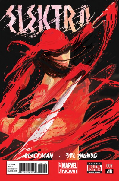
I enjoy how Mike Del Mundo uses swirling red coloring that almost look like Elektra is shaking off paint in this cover. The red, black and white mesh well together.
9. Deadpool: Art of War #3—Scott Koblish
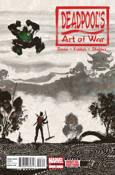
All of Koblish’s
Deadpool: Art of War are great but I enjoy this one because of how zen Deadpool looks with the swirling circles. It makes it all the funnier to see Hulk readying for a crash landing. The background is really pretty and adds to the zen appeal while keeping a dreary grey coating that somehow adds to the effect.
8. Black Widow #13—Phil Noto
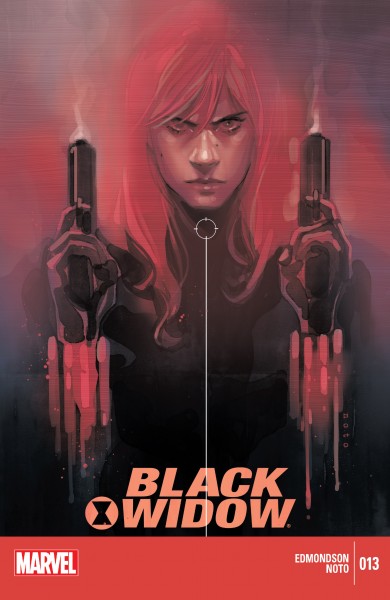
The red painted colors is my favorite aspect of this cover. It merges well with the variety of purples in the background. Noto does a good job drawing Black Widow's murderous glare. The dripping from her bands reminds me not of dripping paint but smeared blood. It all comes together in a beautiful blend of red and purple.
7. Tomb Raider #8—Stephanie Hans
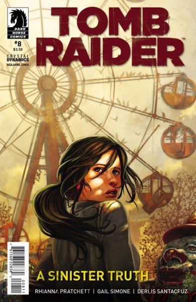
Stephanie Hans painted style in this cover is great. I love the fall colors in the background and the little details like the flocks of birds and vines on the ferriswheel and one of its doors is partially off its hinges. You can really see the disuse of it from these little touches.
6. The Fade Out #1 Variant Cover—Sean Phillips
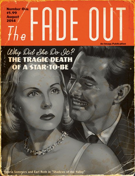
This is a very realistic cover. I like the amount of detail Phillips puts into the characters. The choice to put the cover in black-and-white really sets the noir tone.
5. Batman #37 Variant Cover—Darwyn Cooke
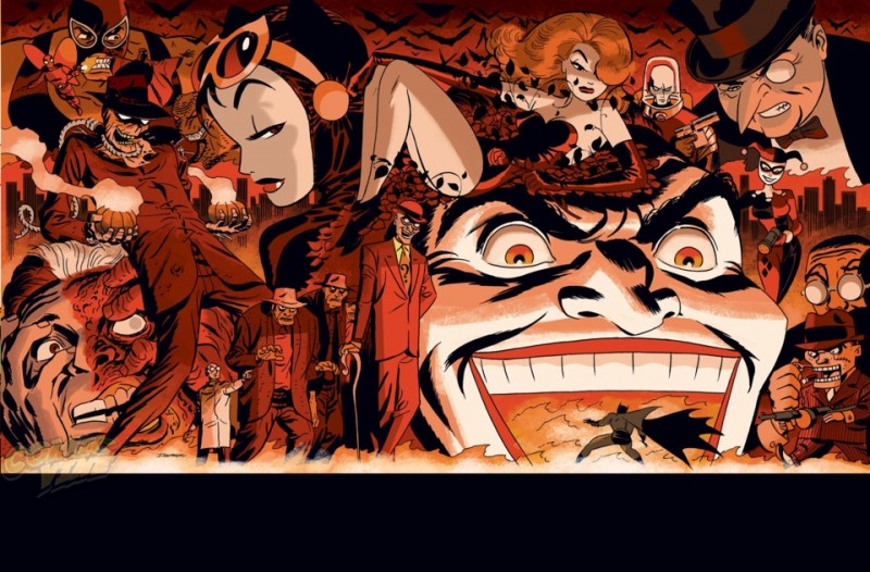
Cooke hasn’t drawn for DC in a while until December when he did all of the variant covers for DC Comics theme that month. I enjoyed all the covers, but this one really stood out. He manages to cram so many villains onto this two page spread, yet it still doesn’t feel cramped. I also like the hellish red shading.
4. Constantine #17—Juan Ferreyra
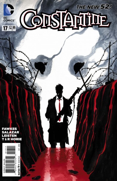
Less is definitely more in Ferreyra’s many
Constantine covers, but never is that more true than in
Constantine #17. Immediately we get a sense of bloodshed on the battlefield thanks to some strategically placed helmets and a lake of blood that is just one of many elements in the cover which sets the ominous tone. The puff of smoke resembling a skeleton is great and I love how Constantine is just a shadow. It makes this look like an abstract piece of art.
3. Raven Nevermore #2—Samuel Casal
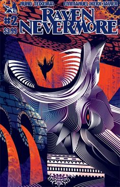
This is a very abstract cover which I adore. The lines swirling around in the wolf makes it look beautiful and animalistic as it’s about to gobble up the raven. The orange and purple combination makes this cover pop out even more on the shelf.
2. Death Of Wolverine: Life After Logan Variant—Julián Totino Tedesco
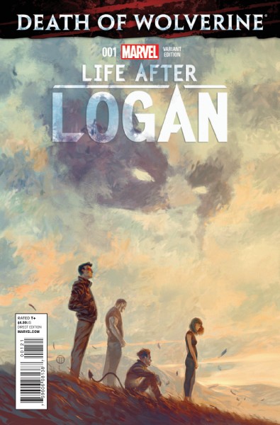
The painted colors of this variant are absolutely beautiful. I love the rural scenery and the Wolverine-shaped cloud. It is a great way to show Wolverine’s presence is felt by the characters even though he isn’t really there.
1. Detective Comics #30—Francis Manapul
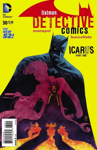
The colors of this cover really pop. The mix of bright yellow and purple mesh surprisingly well. Reducing the characters to colorful shadows was a great choice.
What cover did you think was the best? Let me know in the comments below.
 I enjoy how Mike Del Mundo uses swirling red coloring that almost look like Elektra is shaking off paint in this cover. The red, black and white mesh well together.
9. Deadpool: Art of War #3—Scott Koblish
 All of Koblish’s Deadpool: Art of War are great but I enjoy this one because of how zen Deadpool looks with the swirling circles. It makes it all the funnier to see Hulk readying for a crash landing. The background is really pretty and adds to the zen appeal while keeping a dreary grey coating that somehow adds to the effect.
8. Black Widow #13—Phil Noto
 The red painted colors is my favorite aspect of this cover. It merges well with the variety of purples in the background. Noto does a good job drawing Black Widow's murderous glare. The dripping from her bands reminds me not of dripping paint but smeared blood. It all comes together in a beautiful blend of red and purple.
7. Tomb Raider #8—Stephanie Hans
 Stephanie Hans painted style in this cover is great. I love the fall colors in the background and the little details like the flocks of birds and vines on the ferriswheel and one of its doors is partially off its hinges. You can really see the disuse of it from these little touches.
6. The Fade Out #1 Variant Cover—Sean Phillips
 This is a very realistic cover. I like the amount of detail Phillips puts into the characters. The choice to put the cover in black-and-white really sets the noir tone.
5. Batman #37 Variant Cover—Darwyn Cooke
 Cooke hasn’t drawn for DC in a while until December when he did all of the variant covers for DC Comics theme that month. I enjoyed all the covers, but this one really stood out. He manages to cram so many villains onto this two page spread, yet it still doesn’t feel cramped. I also like the hellish red shading.
4. Constantine #17—Juan Ferreyra
 Less is definitely more in Ferreyra’s many Constantine covers, but never is that more true than in Constantine #17. Immediately we get a sense of bloodshed on the battlefield thanks to some strategically placed helmets and a lake of blood that is just one of many elements in the cover which sets the ominous tone. The puff of smoke resembling a skeleton is great and I love how Constantine is just a shadow. It makes this look like an abstract piece of art.
3. Raven Nevermore #2—Samuel Casal
 This is a very abstract cover which I adore. The lines swirling around in the wolf makes it look beautiful and animalistic as it’s about to gobble up the raven. The orange and purple combination makes this cover pop out even more on the shelf.
2. Death Of Wolverine: Life After Logan Variant—Julián Totino Tedesco
 The painted colors of this variant are absolutely beautiful. I love the rural scenery and the Wolverine-shaped cloud. It is a great way to show Wolverine’s presence is felt by the characters even though he isn’t really there.
1. Detective Comics #30—Francis Manapul
 The colors of this cover really pop. The mix of bright yellow and purple mesh surprisingly well. Reducing the characters to colorful shadows was a great choice.
What cover did you think was the best? Let me know in the comments below.