We have an abrupt, but action-packed start to this vastly superior issue of Static Shock #4. After a boring third issue with villains barely piquing any reader's interest, this issue of Static introduces a slew of new and interesting villains, moves the story forward in a thrilling new direction and makes previously interesting villains all the more entertaining. There are still some problems in the action sequences and artwork, but Static Shock is back to being great, if not the fun, super-charged series it can be.
Static faces off against a steel-skinned baddie while Pale Man contemplates his affiliation. But his change of heart may have come too late, as Piranha, obsessed with a new and powerful drug, decides to test a dangerous chemical on some thugs on the whim of a new and mysterious puppeteer, Doctor Nemo. Writer Scott McDaniel has made the story feel a lot less boring in this issue. Unlike the previous, this issue was much more focused on dialogue and less focused on Virgil's narration. This made the comic feel less like a drag and made the pace move by much more smoothly. The story has also improved with the addition of some great new characters, each with their fair share of flaws, and more elaboration on some of the other already established Static villains.
The Pale Man and Piranha are even more interesting in this issue. Piranha seems much deadlier, while the Pale Man turns out to be much more tragic. It is nice to see his inner battle over whether he should stand-by and watch Piranha self-destruct and hurt others, and I look forward to seeing how this internal conflict continues to play out. Unlike Doctor Nemo's characterization, the Pale Man's back story is paced well and is my favorite element of this issue.
Doctor Nemo is the most interesting new character, but unfortunately, he also has the worst new character design and his story feels rushed. As soon as we meet Doctor Nemo, we know not only his powers, but his motivation. The only thing mysterious about him is his appearance, since he can make himself invisible. But this one sliver of mystery was made inept toward the end of this issue when Doctor Nemo reveals himself and his awkward character design composed mostly of purple. Yes, purple. That just screams evil mastermind. His dialogue is what makes Nemo interesting, and the lengths at which he is willing to go to save himself. He has the potential to be a great villain if his story is slowed down and some mystery is added to his character.
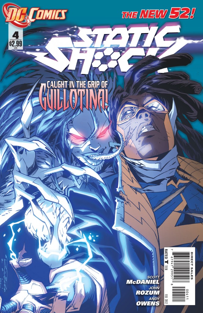
The girl bragged about on the cover was not as interesting or menacing as Doctor Nemo. Guillotina is deadly, but has no interesting dialogue and is in the worst moment of this issue: the opening.
The opening of this comic is abrupt, with Static fighting against Guillotina. The puns were frequent and corny. A couple of them were slightly funny, but the sheer number of them quickly overrode any comic relief and the scene got repetitious. It is nice to see the action sequences, which are more focused on strategy than action, but the puns just ruin the process. The abruptness of this scene also transcends throughout the comic. For every several pages that I read, I had to flip back to make sure I did not miss anything because of the frequently disjointed dialogue. Despite the corny lines in the opening scene, Static's characterization is still brilliant. He is a likeable character, has a good heart and struggles with being a teenager and a superhero. His issues with his sister and her clone (which is which, nobody can tell) only add to his problems, and it is nice to see him break down a bit and confide his problems to his friend Frieda, who tries to cheer him up. The "clone" story with Static's sister Sharon does feel unnecessary, but I enjoy the emotional issues it brings up in Static and am looking forward to seeing its resolution.
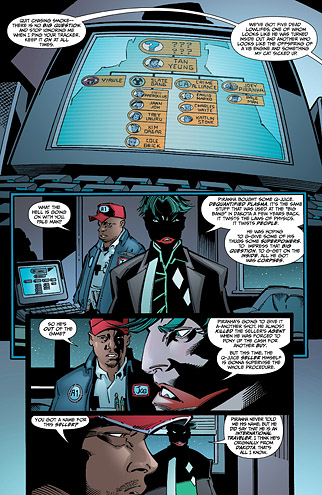
Scott McDaniel's art is also a problem for me. There are only two qualities I enjoy about the artwork in Static: outside of his superhero costume, Static's image is oddly appealing, and Guy Major's colors give this issue a cartoonish but also ominous quality, specifically when Pale Man is cast in shadows while talking to his partner. The rest of the artwork feels choppy. None of the emotions on the characters faces' have as much impact as they should because of the artwork, and I already mentioned the non-threatening character design of Doctor Nemo, our pickled-purple-eater. An even more awkward moment which ruins Guy Major's good coloring job is Pale Man's mouth, which looks like a chipmunk's with bucked teeth and Botox-looking lips.
This issue is a step in the right direction after the downward turn Static took in the last. By introducing new villains and expanding on the already interesting ones in Static's roster, the series has become entertaining again and has almost attained that fun quality. The dialogue is jumpy, the artwork choppy, but the story and characters are still a positive sign for our electro-powered superhero.