Women in Comics: Do the Super Ladies Need Saving? Part 4
Intro
 There are several qualities that have hurt the overall portrayal of women in comics and several suggestions from the interwebs and myself that I think could help further equality in comics. That's what this new series, "Women in Comics: Do the Super Ladies Need Saving?" is all about. Inspired from a Gender Studies inquiry project and a "Gender and Comics" survey I created a couple of weeks back, this series will take an indepth look at women's portrayal in comics. It was originally going to be one feature, but after hitting almost 4,000 words I thought people were much more likely to stay awake if I made it into multiple parts.
If there's a particular topic you'd like me to talk about, let me know! I already have a lot planned including the way women in comics look, the way they dress, how women of race and other ethnicities are treated in comics, how women in comics are abused and I'll be listing some empowering women in comics. But today, it's all about how comic book panels angles can demean women even worse than their skimpy clothing.
For most of the examples I'm going to be using the two mainstream comic book companies Marvel and DC Comics. Independents and other publishers like Image Comics and Dynamite Entertainment have their problems too, but the "Big Two" are the comics that are most widely read, meaning they have a huge impact when it comes to how women are portrayed in comics. These examples are also not limited to just superpowered heroines but also non-superpowered beings and villains.
Please check out the first three parts of "Women in Comics: Do the Super Ladies Need Saving?"
Part 1 - Beauty: One Size Fits All?
Part 2 - Victoria Secret-esque Styles
Part 3 - What's so bad about a broken back?
Time for a close-up...
Women in comics don't even need sexy clothing half the time when the way the panel is drawn leaves little to the reader's imagination. This is another issue with sexy women in comics that actually gets under my skin: The inappropriate, obviously shoe-horned in way women are demeaned in panels. Sometimes this can intersect with how women seem to pose in comics, but I wanted to dedicate a full article to the angles of panels and not just throw it in with posing.
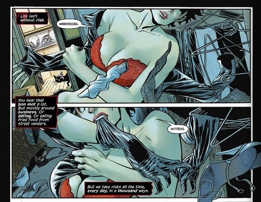
Panels of women in comics often accentuate parts of their bodies to make them appear sexier. There are sometimes panels that are drawn above or below women, either looking down at their breasts or up at their skirts, revealing their underwear (a technique I've also seen a lot of in anime). Sometimes the artist doesn't even bother including the entire women and instead focuses solely on her breasts or butt. Something I didn't notice when I first read
Catwoman #1 was that for the first couple of pages you never see Selina's full face, just her bra and underwear. If this had happened to a less sexually liberated character maybe it would have stood out in my mind more that Catwoman was being turned into a physical piece of meat who didn't even have a face.
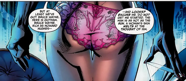
Butt shots are one of the more infamous and obvious panel angles. The funniest example has to be when Frank Miller exploited Vicki Vale's ass in
All-Star Batman and Robin. The dialogue makes it look like her butt is talking to us. Subtle. But for a more frustrating use of butt shots, there are a few in
Witchblade: Demon Reborn. The reason these are more frustrating is because Frank Miller's story makes us laugh at how blatant and stupid his treatment of women is. But butt shots in comics like
Witchblade: Demon Reborn are where the real problems are because they take us out of the story about a mother trying to rescue her daughter. One moment I mentioned in my review of the issue was when Sara has an emotionally empowering scene that quickly felt ruined with a terrible butt-shot of her in tight pants with their own glare to make it clear what we're supposed to be looking at.
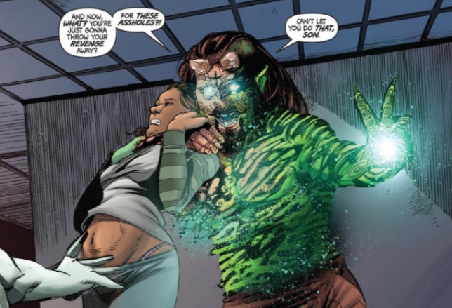
Another example that really is insulting to the story is while a psychiatrist is being held hostage in
Evil Ernie her thong (because all psychiatrists secretly dress like Victoria Secret models under their suits) is clearly visible in the full-page spread. She's in danger of being killed and this is when the artist decides to show us her underwear?
These subtle (and not so subtle) moments add nothing to the story and are kind of off-putting to female readers. It's even worse when the character in question is a shy kind of girl or a woman who doesn't like to strut her stuff because it is just out of character for them. Another big problem is if this practice runs rampant it can take you out of the story.
But what do you think? Are the way panels are angled really a problem? Let me know in the comments below and join me next time when I talk about empowering women in comics.
Part 5 - Empowering Women in Comics
Part 6 - Abusing Women in Comics
 There are several qualities that have hurt the overall portrayal of women in comics and several suggestions from the interwebs and myself that I think could help further equality in comics. That's what this new series, "Women in Comics: Do the Super Ladies Need Saving?" is all about. Inspired from a Gender Studies inquiry project and a "Gender and Comics" survey I created a couple of weeks back, this series will take an indepth look at women's portrayal in comics. It was originally going to be one feature, but after hitting almost 4,000 words I thought people were much more likely to stay awake if I made it into multiple parts.
If there's a particular topic you'd like me to talk about, let me know! I already have a lot planned including the way women in comics look, the way they dress, how women of race and other ethnicities are treated in comics, how women in comics are abused and I'll be listing some empowering women in comics. But today, it's all about how comic book panels angles can demean women even worse than their skimpy clothing.
For most of the examples I'm going to be using the two mainstream comic book companies Marvel and DC Comics. Independents and other publishers like Image Comics and Dynamite Entertainment have their problems too, but the "Big Two" are the comics that are most widely read, meaning they have a huge impact when it comes to how women are portrayed in comics. These examples are also not limited to just superpowered heroines but also non-superpowered beings and villains.
Please check out the first three parts of "Women in Comics: Do the Super Ladies Need Saving?"
Part 1 - Beauty: One Size Fits All?
Part 2 - Victoria Secret-esque Styles
Part 3 - What's so bad about a broken back?
Time for a close-up...
Women in comics don't even need sexy clothing half the time when the way the panel is drawn leaves little to the reader's imagination. This is another issue with sexy women in comics that actually gets under my skin: The inappropriate, obviously shoe-horned in way women are demeaned in panels. Sometimes this can intersect with how women seem to pose in comics, but I wanted to dedicate a full article to the angles of panels and not just throw it in with posing.
 Panels of women in comics often accentuate parts of their bodies to make them appear sexier. There are sometimes panels that are drawn above or below women, either looking down at their breasts or up at their skirts, revealing their underwear (a technique I've also seen a lot of in anime). Sometimes the artist doesn't even bother including the entire women and instead focuses solely on her breasts or butt. Something I didn't notice when I first read Catwoman #1 was that for the first couple of pages you never see Selina's full face, just her bra and underwear. If this had happened to a less sexually liberated character maybe it would have stood out in my mind more that Catwoman was being turned into a physical piece of meat who didn't even have a face.
 Butt shots are one of the more infamous and obvious panel angles. The funniest example has to be when Frank Miller exploited Vicki Vale's ass in All-Star Batman and Robin. The dialogue makes it look like her butt is talking to us. Subtle. But for a more frustrating use of butt shots, there are a few in Witchblade: Demon Reborn. The reason these are more frustrating is because Frank Miller's story makes us laugh at how blatant and stupid his treatment of women is. But butt shots in comics like Witchblade: Demon Reborn are where the real problems are because they take us out of the story about a mother trying to rescue her daughter. One moment I mentioned in my review of the issue was when Sara has an emotionally empowering scene that quickly felt ruined with a terrible butt-shot of her in tight pants with their own glare to make it clear what we're supposed to be looking at.
 Another example that really is insulting to the story is while a psychiatrist is being held hostage in Evil Ernie her thong (because all psychiatrists secretly dress like Victoria Secret models under their suits) is clearly visible in the full-page spread. She's in danger of being killed and this is when the artist decides to show us her underwear?
These subtle (and not so subtle) moments add nothing to the story and are kind of off-putting to female readers. It's even worse when the character in question is a shy kind of girl or a woman who doesn't like to strut her stuff because it is just out of character for them. Another big problem is if this practice runs rampant it can take you out of the story.
But what do you think? Are the way panels are angled really a problem? Let me know in the comments below and join me next time when I talk about empowering women in comics.
Part 5 - Empowering Women in Comics
Part 6 - Abusing Women in Comics